How To Use Landing Pages
IMPORTANT NOTICE: Facebook does not auto-populate all links with the correct photo. Unfortunately, not something we can fully control on our end. The best way to set up your ad on Facebook, if this is the case, is with two methods.
1. Use a standalone image of a house in your ad, then add the call to action text and link in the text spot. So this way, you have a beautiful and large image of a home to capture attention, then potential leads can click the link in your text area of your ad. Don't let the automated image from your landing page auto-populate, just add your own image to your post.
2. Similar to method one above, instead of using a picture of house, you can take a screenshot of your landing page and post that as the image on your ad. You can take a free screenshot here >>> Website Screenshot.
Please read further to understand the purpose of landing pages when it comes to using them for lead generation, below.
"I've got my landing page, now how do I use it?" I get this question quite often! In the upcoming marketing modules, you'll find video tutorials on setting up different types of ads, and using your landing page to capture leads. But I decided to also provide a general overview of a landing page and it's use, since they are provided as part of your membership, and can be very effective in lead generation. If you haven't already ordered one from us, you can do so here , it's covered in your membership.
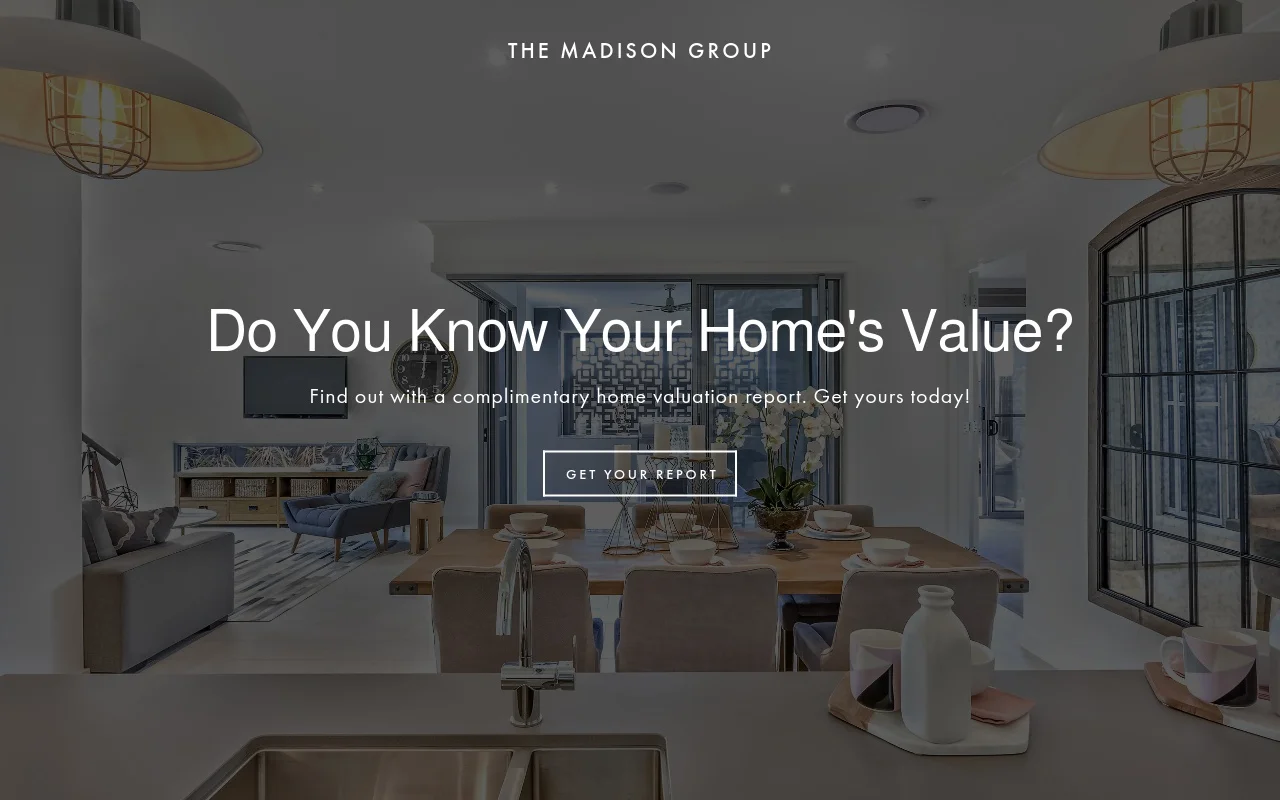
A landing page is like a website, however with one particular task in mind, and that's to capture leads. It is a one page website that has a standard guideline for being functional. Here is what you'll find on a landing page:
1. YOUR HEADLINE
2. A DESCRIPTION
3. A CALL TO ACTION
4. A SIGN-UP FORM
5. A RELEVANT IMAGE
In our case as real estate agents, your headline is going to be related to the audience you are marketing to: be it sellers, buyers, or renters. A typical headline you may find on a real estate landing page is "Find out how much your home is worth," or, "Get a list of homes for sale." Then, you follow up with a brief description. For example, "Sign up with your email address to get a complimentary CMA report." Or, "Sign up with your email address and get a list of homes for sale that meet your needs." Your headline draws attention to something they may find interest in if they are planning on buying or selling, and your description provides the solution you'll provide them. Your call to action can also be in your description, or on the form button, encouraging them to sign up with their email or phone number. Your purpose of your landing page is to give the website visitor value enough to want to share their personal contact information with you. Which, then, turns them into a lead that goes into your database to nurture.
Following the headline, description, and call to action - you'll have your contact form. Now you want to keep this contact form as short as possible. The shorter the form, the larger quantity of sign-ups you'll get. Now if it's a long form, you may get more solid leads that have stronger interest in buying/selling, but the leads will come in far and few between. You want to build a large database of emails to nurture for the long haul, so a short form is always recommend. Statistics have shown that if your form is a pop-up that comes up after clicking a button, the return rate has been much stronger than if the form was resting directly on the page. Not sure why this is the case, but countless studies in TODAY's marketing has proven a button that opens the form, works best. Then for your image, you want to use one that is of high quality and really stands out, and of course, is relevant to the industry we are in. So it would be a picture of a home - interior or exterior shot will work.
So in all, it's a very simple, one-page website that's sole purpose is to collect leads for you. Now of course you have to advertise your landing page like you would any website. Landing pages are far more effective for lead generation in marketing, than websites are, because there is a lack of distraction. You pinpoint them to exactly what you want them to do, and let them know what they'll get in return, and this makes the return on leads much bigger.
Now we'll dive into more detailed tutorial videos in the upcoming modules to show you how to set up Facebook ads with landing pages in the best way, but they can be used anywhere you would place a website link. On your social media bio, in social media ads/posts, on your business cards, flyers, yard signs, etc. The leads will come to you if you market the link to your landing page; the more you advertise it, the more leads that will come through from your site for you to work on. You can also use landing pages to showcase your listings. A single property page is actually very enticing to seller prospects. You can let them know you'll have a "website" created solely for their home to showcase it without competition. Than you can share the link to your listing's landing page, that has photos and descriptions of the property, to land buyer leads that would be interested in setting up an appointment. So to recap, a landing page is a simple, one-page website that entices visitors to share their personal info with you in exchange for data - homes for sale, home valuation, etc.
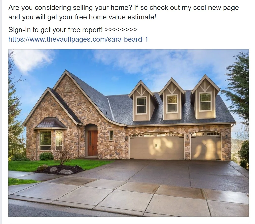
Although upcoming videos will show the best methods in using your landing page, you can find my most recommended set-up below. The following ad can be used on Facebook: on your personal page, business page, or in groups. You're going to want to have a small bit of text, enticing buyers or sellers to visit your page in return for data. The same method followed on the landing page verbiage. Then you'll want to create a call to action to visit your site, and I always set it up like so: >>>>>>>> www.ThisIsWhereYourLinkGoes.com
to draw the most attention. Then, I follow up with a beautiful picture of a house exterior to capture attention. I avoid using a clickable image because they have terrible results in comparison to just a standalone image.
I know most social media "gurus" preach to use a clickable image in ad sets, but as an agent who spent years and thousands on social media ads, clickable image ads completely bombed in comparison to just keeping the image as-is. And here is why:
1. We as humans are so bombarded by advertisements in every aspect of our lives, that we become desensitized to it, and overlook it. Someone will scroll past your post with a clickable image, see it leads to an outside site, and that generally turns them off instantly. Or their subconscious just tells them ad/spam, keep scrolling, and they miss it.
2. Social media users go on Facebook to interact with friends and family. Not to be sold something to. So by placing an image that blends in with their timeline of what friends and family post, they will be more inclined to take a look at the details, instead of scrolling past.
3. Facebook doesn't want it's users leaving the platform. I am all about numbers, and one thing I noticed significantly was the lack of viewers on my posts if it was a clickable image. If I just added a little verbiage, a link, and a picture that stood out on it's own, it was shown to far many more organic viewers, even with both ads having 0 engagement, than an image that can be clicked. Which means Facebook went out of it's way to suppress ads that blatantly lead away from their platform.
So what does this mean? That if it's a clickable image ad, it'll have worse results, and you'll end up spending more money on ads. So throw out the clickable ad and just put up an image that is going to make people WANT to stop to see what your post is about. And that's how you'll win them over to check out your site. Set up your ads for the landing pages you get from us, similar to the one below (changing the verbiage as needed), and you'll be golden!


